F a v o r i t e A r t i s t sMy top five favorite artists are Vincent van Gogh, Sara Stieber, Benjamin Von Wong, and Niki St. Phalle. the reason why I choose these artists is because they all have their own unique type of artwork. All of them have a different style and have their own kind of passion for art. They all have a different art style from typical artists out there and use originality to create something. All their artworks have great meaning and give viewers some sort of emotion to them and more meaning.
0 Comments
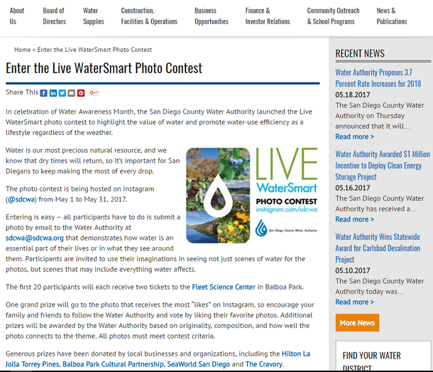 The #LiveWaterSmart photo contest which is hosted on Instagram (@sdcwa) from May 1 to May 31, 2017 is a contest to highlight the value of water and promote water-use efficiency as a lifestyle regardless of the weather. Although entering is easy for participants, some students agree that the "most liked" voting system is the fairest, however a majority of others do not agree. The winner of the competition will be determined by the number of "likes" the best photo receives. While Mr. Lim was explaining the voting system to our class, some students such as Christian Bourke agreed with the voting system and said, "If people like your photo, they will leave a like on it, and if they don't like it, they're obliviously not going to leave a like." Although some may agree with this, other students including Joshua Ibasco said, "The voting system is practically a popularity contest which isn't fair because it doesn't prove which is the best quality photo." Mr. Lim is recommending a better voting system: the top 5 most liked photos become the finalist, then judges pick the best photo out of the top 5.
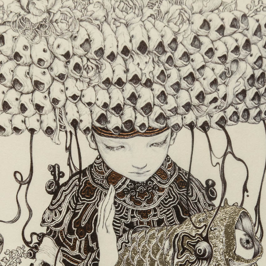 by James Jean what i like about this artwork is how this artist used a unique technique and used what looks like pencil and or just a pen. This looks great even for a pencil or pencil drawn artwork. i love the repetition of the fishes on the head. I think this is some sort of cultural artwork and this have some sort of meaning. I'm not sure what the eyes in bag mean, but I believe it might be something symbolic. What could of been different is maybe adding something more to the background since it's too plain and could of been something more. Overall, I love he rtist's style and his idea and imagination. It seems like his form of art is "magical realism" and very realistic.
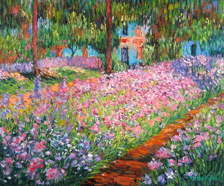 by Claude Monet what i like about this artwork is the variety in this artwork. I also like the colors of bright and lively colors. The mood and feelings that this artwork gives me a sense of happiness and free. i could image the breeze and the smell of freshly bloomed flowers. I also like the art technique of the paint and how the trees have a shape of ovals or circles. You could really tell this is a painted artwork. what could of been different is maybe adding animals into this to make it looks more of nature and or maybe adding someone walking the path since it would catch viewer's eyes. Overall, I love this artwork and the colors used look so lively and bright and gives me a sense of happiness.
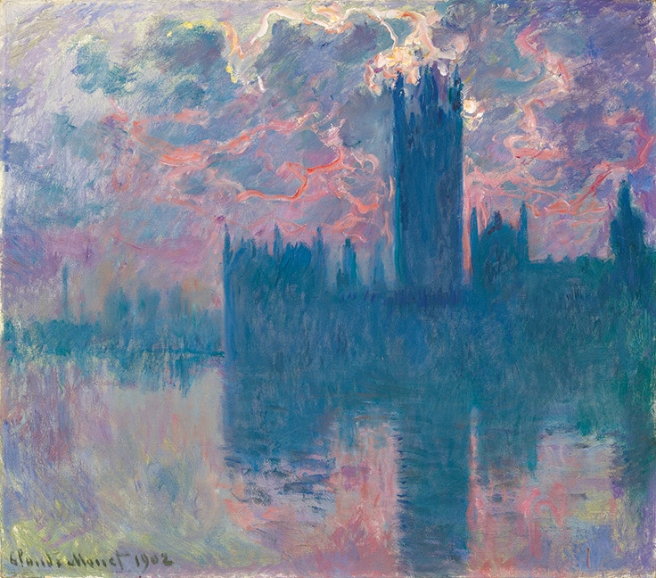 "London" by Claude Monet What I like about this artwork is the colors and the technique used. I love how the colors looks well blended together and the reflection of Big Ben in London. I also like how proportionate and well balanced this looks like and the colors are mostly cold light colors and a hint of warm colors like the orange. what could of been better is maybe making the water more like actually water and or change the water color to make it more realistic. Overall, I love the artwork and the artist's style of using paint and also the colors.
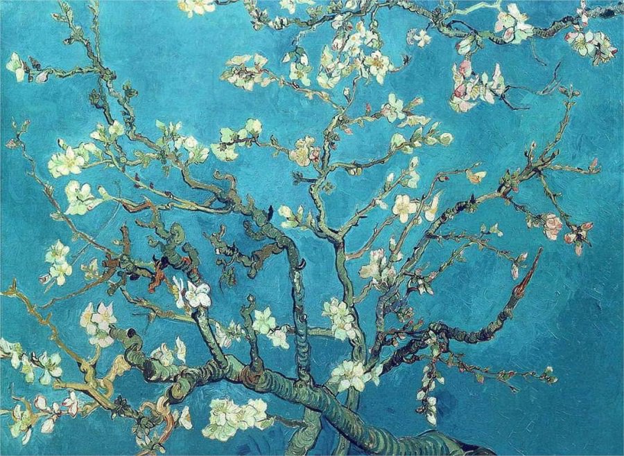 by Vincent Van Gogh What I like about this artwork is the detailing of this artwork and the strokes of the paint bush of the background. I love the shade of blue color of the background and have a nice blend between the dark and light blue color. I like the small detailing of the tree branches and the color of the flowers of how it pops out from the dark or light blue color. what could of been different is maybe adding maybe a bird on the branch to make it more appealing to the viewers and or maybe the detailing more on the flowers like the branches of the trees. Overall, i love this artwork and van Gogh's style of art.
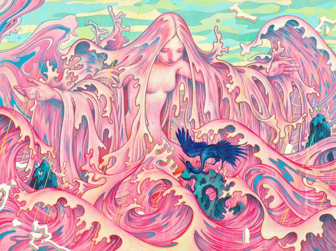 by James Jean Like i said in the previous blog, Mr. jean's artwork is outstanding. It's very detailed and there is so much happening in one artwork. Everything to me in here is like an allusion to my eye since there's so much going on. The repetition of the waves make it seem like a real ocean and the colors of the pink remind me of bubble gum. The picture also looks very balanced and the parts of blue mixes well with the pink. this artwork could symbolize the ocean and how maybe we should love our Earth and the water. Also, to keep our water very clean. What could of been different is maybe adding some fish in the ocean since it is actually an ocean to make it more realistic or "magical realism". Overall, I love this artwork and the artist's style.
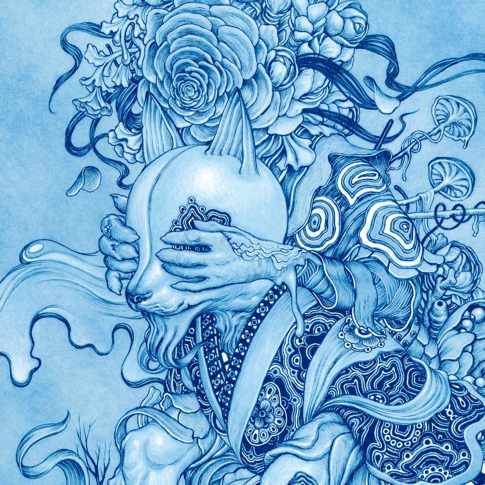 “Zugzwang” by James Jean What I like about this artwork is the color of the blue and the detailing. since all the artwork is blue, the details really help distinguish what the artist is trying to draw. I believe the meaning behind this artwork is very inspiring and somewhat cultural. What i noticed about the artist is that he uses cultural in his artworks to creating such a meaning piece of art. I like the flowers and the detailing of everything. Even the shading is well drawn/painted. What could of been better is maybe adding some color to emphasize the characters to give it more like meaning behind it or to make something stand out more since everything blue. Maybe the blue represents the mood of sadness since blue is often portrayed as sadness in art. Overall, I love the artwork and Mr. Jean's work of art.
|
